For the past 15 years, ANSR has been an extremely client-centric and inclusive organization, where the customer’s views, perspectives, culture, values and vision took precedence over anything else. If you take a closer look at ANSR’s outgoing logo, you can see an effective manifestation of all these elements. The concentric pattern means ANSR’s customers hit the mark every single time, and the red quotation marks represent the company’s inclusive and collaborative nature when working with customers. There is a grey quote mark that symbolizes ANSR’s unique point of view stemming from its experience of working closely with multinationals while setting up their Global Capability Centres (GCCs). The red brand colour brilliantly represents ANSR’s authority and leadership in the industry, while grey hints at the brand’s inclusive and collaborative nature. Overall, the logo symbolizes completion, harmony, wholeness, connection and unity.
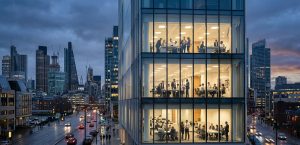
Today, having enabled over 120 GCCs for the world’s leading organizations, ANSR is uniquely positioned to help global enterprises to build, scale and manage global teams in talent hubs across the world. The recent big changes in ANSR’s business structure and vision provided us with the opportunity to stop and consider how the business is perceived by customers and employees alike. We realised it was time to refresh the brand touchpoints, from messaging to visuals, that will help communicate the organization’s new direction with clarity and consistency.
We began the design process by looking at where we were currently, analysing the strengths and weaknesses of the current brand identity. We didn’t want to dismiss the psychology and symbolism being presented by the circular motif as it represented completion, wholeness and unity. We also looked at opportunities around simplification and a more considered approach to typography and colour to better portray a feeling of prestige, thought leadership and strength.
Colour Theory
Understanding there was no obvious direct competitors we researched the comparative landscape instead. Here we found opportunities to stand out within the orange and teal space we explored this pairing and began to experiment with the mood and emotion it generated as a visual language. We found it to be sophisticated, had strong contrast, it was confident identifiable and it felt unique it also worked well with negative space it was clean versatile and it had a real sense of maturity to it due to its uniqueness and elegance this ended up being the preferred colour palette.

The New Logo Mark
Based on many hours of discovery, we set out to build an identity that was elegantly interconnected with presence and strength we wanted to bring two parts together working in perfect harmony to represent collaboration and partnership we also wanted it to resemble a light shining on a new future of business the strength of the original logo mark inspired us to explore sacred geometry it is said that every natural pattern of growth or movement comes back to one or more geometric shapes sacred geometry can be seen in the forms numbers and patterns seen throughout the natural world.

For example, the spiral of a snail shell, the captivating pattern of a single snowflake, and the branches of a tree. Built on a framework that was inspired by sacred geometry, we started with radial light beams that are energetic and welcoming – the open arms of partnership. We then introduced steps representing progress and exponential growth, bringing the two parts together working in perfect harmony speaking to both the collaborative partnerships and end-to-end solutions that ANSR provides, And, we brought it to life! We affectionately call it the ‘Future Beam’ – a guiding light forward for growing innovative businesses.

Typographic pairing
We decided that uppercase has the strength we were looking for, inspired by constructivism, a philosophy that aimed to reflect modern industrial society and urban space, we took an already bold statement and refined it to reflect the technology age. The result is a brand mark that’s unique, elegant and progressive. To ensure it was also functional, not just pretty, we made it work beautifully on screen utilizing the high contrast orange to draw the eye. The logo paired with the high contrast colour palette and elegant photography is easily identified and the logo is recognizable at small scale. Negative space creates legibility and simplicity, while the bleeding gradient light creates interesting opportunities across traditional advertising.
 As the new chapter of ANSR evolves, the new brand identity is something the employees and stakeholders can be proud of for the long term.